
So I have been inspired by The Nester to redo my bathroom. Well, maybe the
more appropriate term would be to "do" my bathroom. It's just one of those rooms that never got "done." It did take me a little more than 10 minutes, but I did a LOT of stuff! Each project only took about 10 minutes, though. It was incredibly easy. Made me wonder why I'd never gotten around to it in the 5 YEARS I've lived in this house.
Here's the before.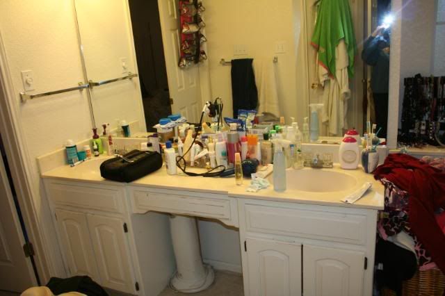
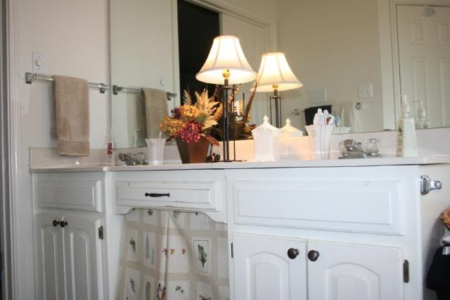
The first thing I did was clear the clutter. Most of it went in the trash. What I did keep went in the cabinets or behind this.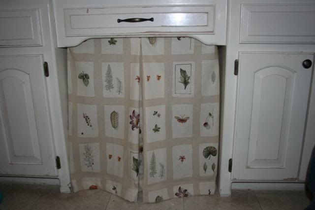
I made this "mistreatment" with fabric I've had for years that my mother-in-law gave me (thanks Kathye!), my sewing machine and some hot glue. I know, many of you are probably shuddering, but would you have known I hot glued it on if I hadn't said so?
After one quick (and cheap) run to Wal-Mart, I had my new knobs. They were the only thing I spent $$$ on for the entire redo. And they were from Wal-Mart, so I didn't break the bank. :) Everything else I already had - I just shopped my house!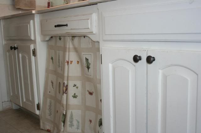
Here's where it gets tricky for me. I'm not great with arranging things and making them look pretty. I really need some help. PLEASE give your opinions!!! Let me know which arrangements you like the best OR even better, give a different idea! Sometimes I get trapped and just can't come up with anything else. Here we go...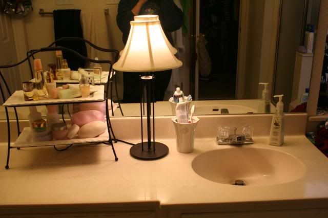

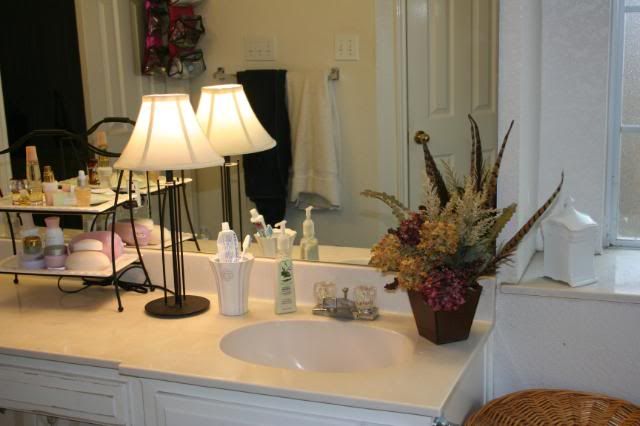
OR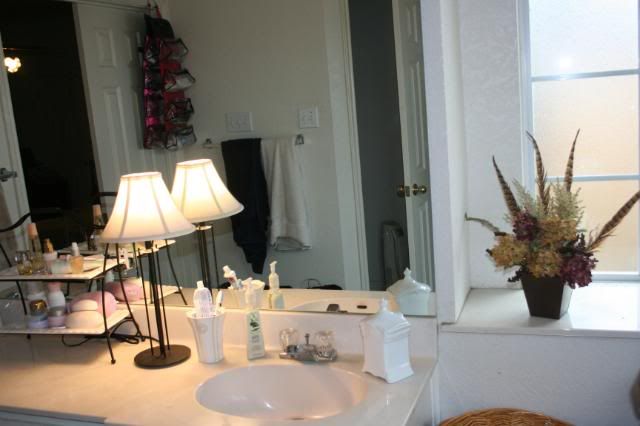
OR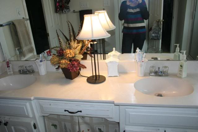
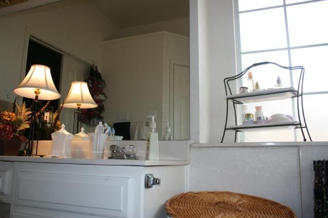
Now that I'm looking at the pictures, I don't really love any of the combinations I came up with. I need some opinions! And if you have any ideas of something that might look good, just mention it - I might have just that perfect thing stuffed away in a closet somewhere!
*******UPDATE********
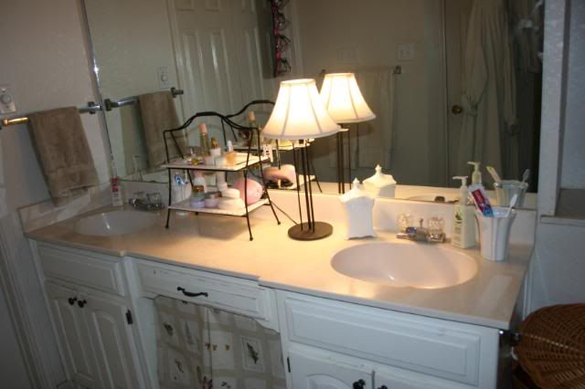
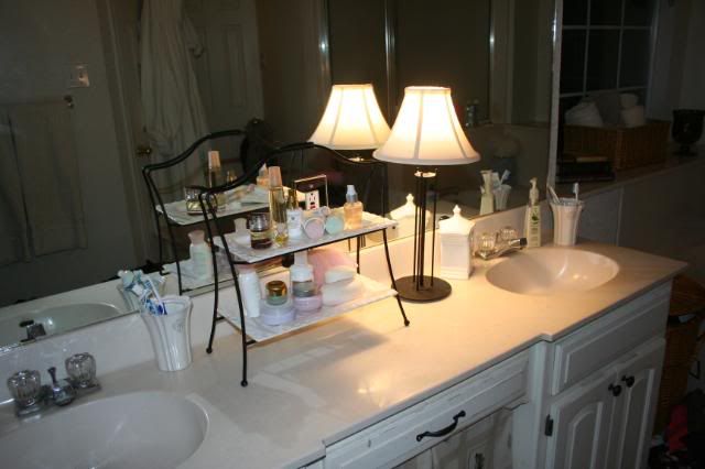
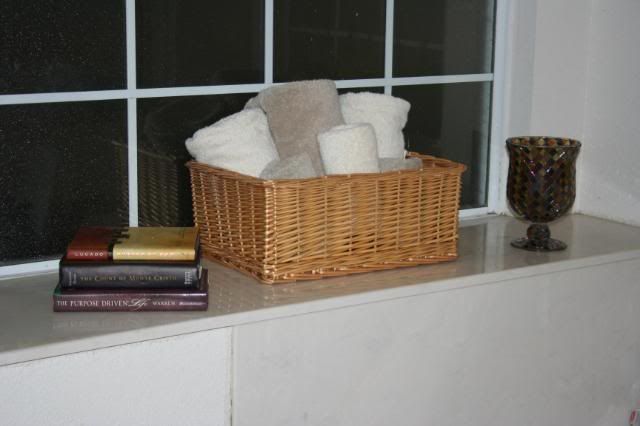
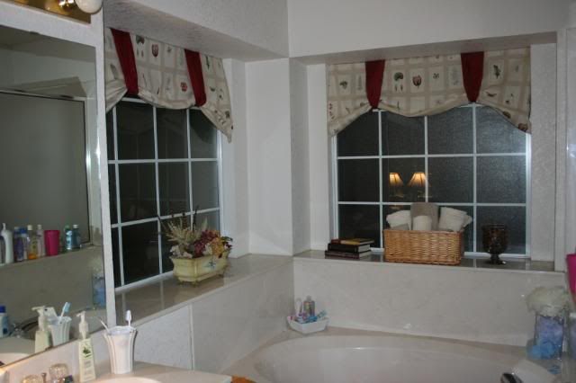
Okay people - this is what I have now. I am much more happy with this than any arrangements from yesterday. I also added some window mistreatments from leftover fabric. Woohoo! Thoughts? Suggestions? Should I scrap it all and start over?
Or is it better with the basket and floral arrangement switched?




31 comments:
You are so brave to post pictures of your messy bathroom counter on the internet! (What is that white column thing under your counter)?
Isn't it amazing how much better knobs and handles make cabinets look? I like the 3 tiered thing in the between the sinks. The lamp looks kinda odd to me. Did you get that candle holder from Target? I think I have a tealight lamp that matches that, which I don't have a place for. You're welcome to use it if you want.
Hmmm, such choices! I think all of them are good in their own ways, but I think the less you have up there, the better. Isn't that two-tiered thing what you always put your apple dip thing on?? What will you put those on if you use that in your bathroom?! ;-) I think I like #1 or #5 the best. But, I'm not necessarily the best one to ask as far as this is all concerned! LOL!
I like #5 and I like the lamp. I think it makes it look softer. I really like the nobs. I am hoping to put nobs on our cabinets soon.
Thanks for the suggestions! I've changed some things around and will add updated photos soon!
Oh, and Jennifer - yes, that is what I put my apple dip on for showers! Maybe I'll just have to buy another one. Brooke would love that!
I just wanted to say that I adore all of the crafty things you've been doing lately. I wish I had time to craft! The bathroom re-do looks fantastic also, regardless of how you decided to arrange things!
Hey Girlfriend!
We've been out of town until yesterday, but it looks like you've been a busy little bee!
Your bathroom re-do looks so FANTASTIC...
great cabinet mistreatment...check
great curtain mistreatment...check
ambiance lighting...check
soft touches...check
Also, I like the final way you arranged the countertop and I think the bath area looks the best switched as you showed in the last photo. Remember you can always add height by placing the candle holder on top of the stack of books! I love the feathers in your arrangement, good addition! Do you have a pretty rug in there too? That will always add softness and you can ALWAYS pull a color palatte together with a great rug! Okay, I will stop with all design talk :) So fun though!
HUGS
P.S. We are starting on a bedroom redesign...I have sketches of what we're going for so the next time we're together remind me to pull them out! My curtains have already arrived, bedding should be arriving next week. Painter is coming next week and new hardwoods going in! YAY
Uhhh, ummm, I second what Becky said. ;-)
PERFECTO MUNDO! You are a great student of The Nester! She will be so very proud.
Karol :0)
OK, you win...great make-over! Keep it, the window treatments are great.
Huge transformation! Seeing the before {that we have ALL had to deal with!} makes the after that much better!
Great work!
not go back over to Nesting Place and re link directly to THIS POST.
Thanks hon!
whoops. that was spossed to be "now" not "not"
but you figured it oul I mean out.
Your bathroom looks great, what a fabulous job!
If you're still asking for suggestions, I think the try thingy is beautiful and would look great in the center. The lamp might be a little large for your counter space, I have the same issue.
Looks great! Please come over and do mine!! :)
M ^..^
Oh, I'm clapping! It looks so good! I love your mistreatments, and the spa feel you have going on. Great job.
Your bathroom looks fabulous! I like all the arrangements you have made!
What a beautiful bathroom you have! I really like each idea that you showed and especially like the double tray for items used often.
The knobs look amazing! What a great look!
Sincerely ~ Tricia Anne
Love what you have done, but I REALLY like the flower arrangement on the counter by the sink. It brings in great color! You have lots of space to work with, and have done a super job.
~Misti
You really went to work. My counter looked the same. I love your tiered stand and flower arrangement. I like both the lamp and stand, but think that it might be to cluttery with both of them in my opinion, but hey i'm no professional. Great job. Oh, i love that you are a Mary Kay user i actually am a consultant.
Great transformation, way to get busy on it!
happy day,
melissa
Wow! What a great transformation! Love the knobs and fabric. My opinion: I like the floral arrangement w/ the lamp in the middle. On the ledges, I'd either replace the floral with the two-tiered thing or switch the floral with the basket. So the floral goes with the books and candle to give it more visual weight to balance out the chunkier basket.
Thanks for visiting my blog, too!
Thank you everyone for the suggestions and compliments! I agree that I need a smaller lamp and I switched the floral arrangement with the basket and it looks much better. I love having LOTS of sets of eyes for opinions - usually it's just me and I can't think of everything!
Wow - what a great redo! I love the fabric panel - it looks great! I also love the tiered plate rack to store the bathroom things. You did a great job.
It is lovely!
Jen
The fabric panel is wonderful! I love the basket of towels and the tiered server usage. I want one of those!!! Of course, my bathroom is about the size of a public restroom stall!
great ideas - looks like you now have a bathroom you can just love using!
The fabric curtain is great! And I would keep the lotions and potions on the sink... easier to get to.
The mistreatment is great!! And I like the toiletries in the tiered rack on the counter and the towel basket on the right side window like you have it. VERY nicely done!!
Love the look for you blog. So happy. Nice job on the bathroom.
My 'vote' is to RELAX. Let yourself enjoy that it is better than before and just go with it. It will change over time, but really make it useable, enjoy the relaxing feel and wow you rocked those window mistreatments!
as potential PROOF I am 'right' LOL my word verification 'word' is calmmenc. COmmence to be calm! LOL
It looks so great!! Your bathroom seems o big. Good job!
LOVE the basket, arrangement and widow "mistreatments"! Makes you want to just jump in for a long soak. How did you make those window treatments?
Post a Comment